[The World]
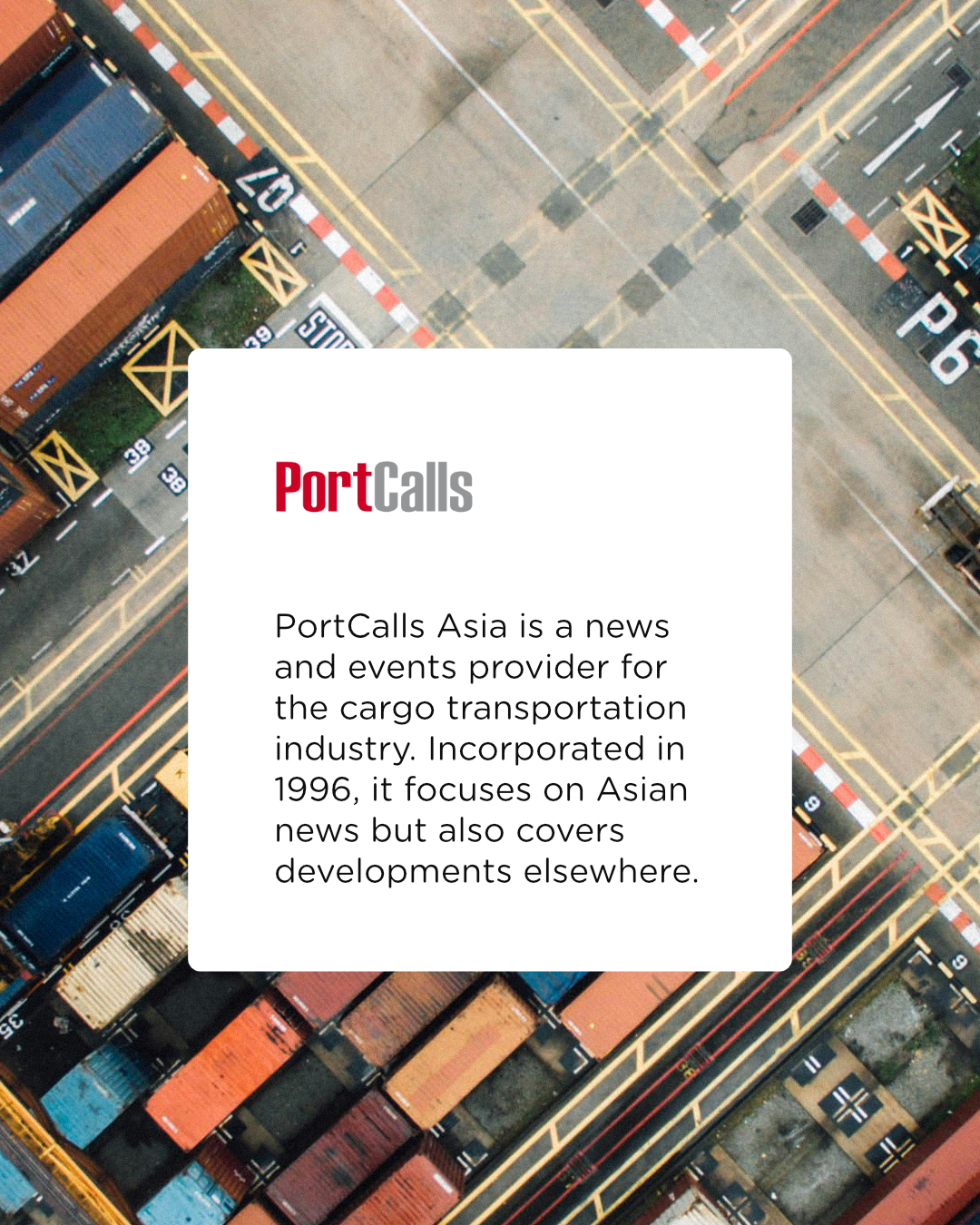
PortCalls is a news and data publication serving professionals in the cargo transportation and logistics industry. With a longstanding presence in the field, it has built a place for itself as a trusted source of industry news and insights.

As the industry and its audience moved further into the digital age, PortCalls faced an opportunity to bring its identity forward. The challenge was to reflect the evolving habits of a new generation of readers while preserving the familiarity and credibility built over decades. The identity needed to honor its history while finding its place in an increasingly digital world.
[Client][Project]
PortCalls
[Services]
Identity Design > System
[Studio/Company][Role]
Before Studio
Creative Director & Brand Designer
[The Visual Identity]
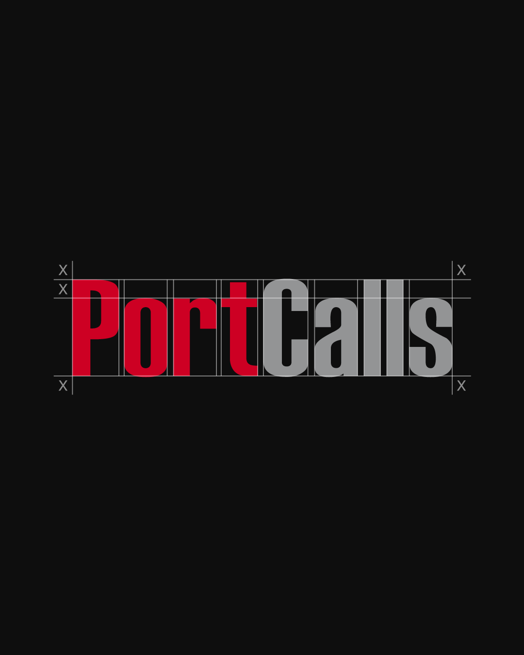
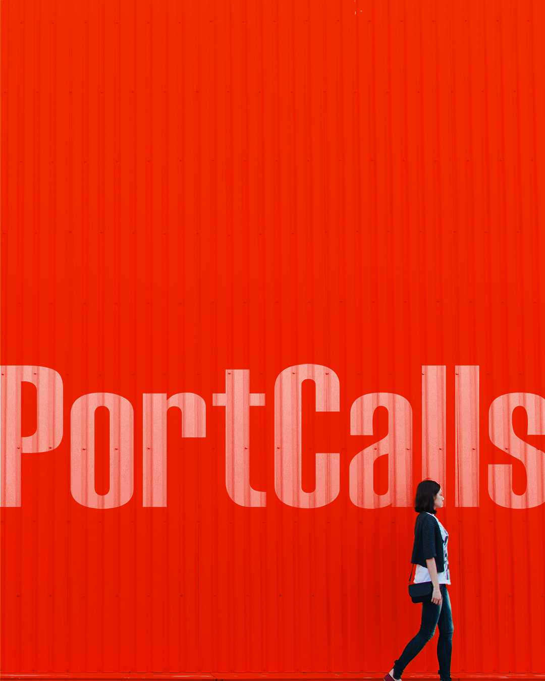
The logo is a refined, modernized interpretation of the original wordmark—slimmer in form, yet retaining the curves that make it familiar to longtime readers. The redesign preserves the equity built over the years while giving the mark a more contemporary presence.

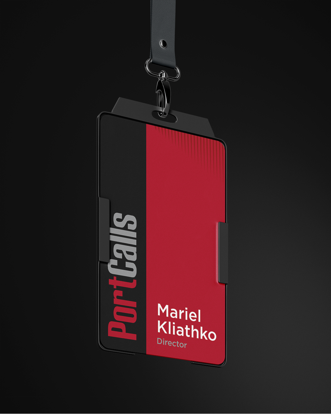
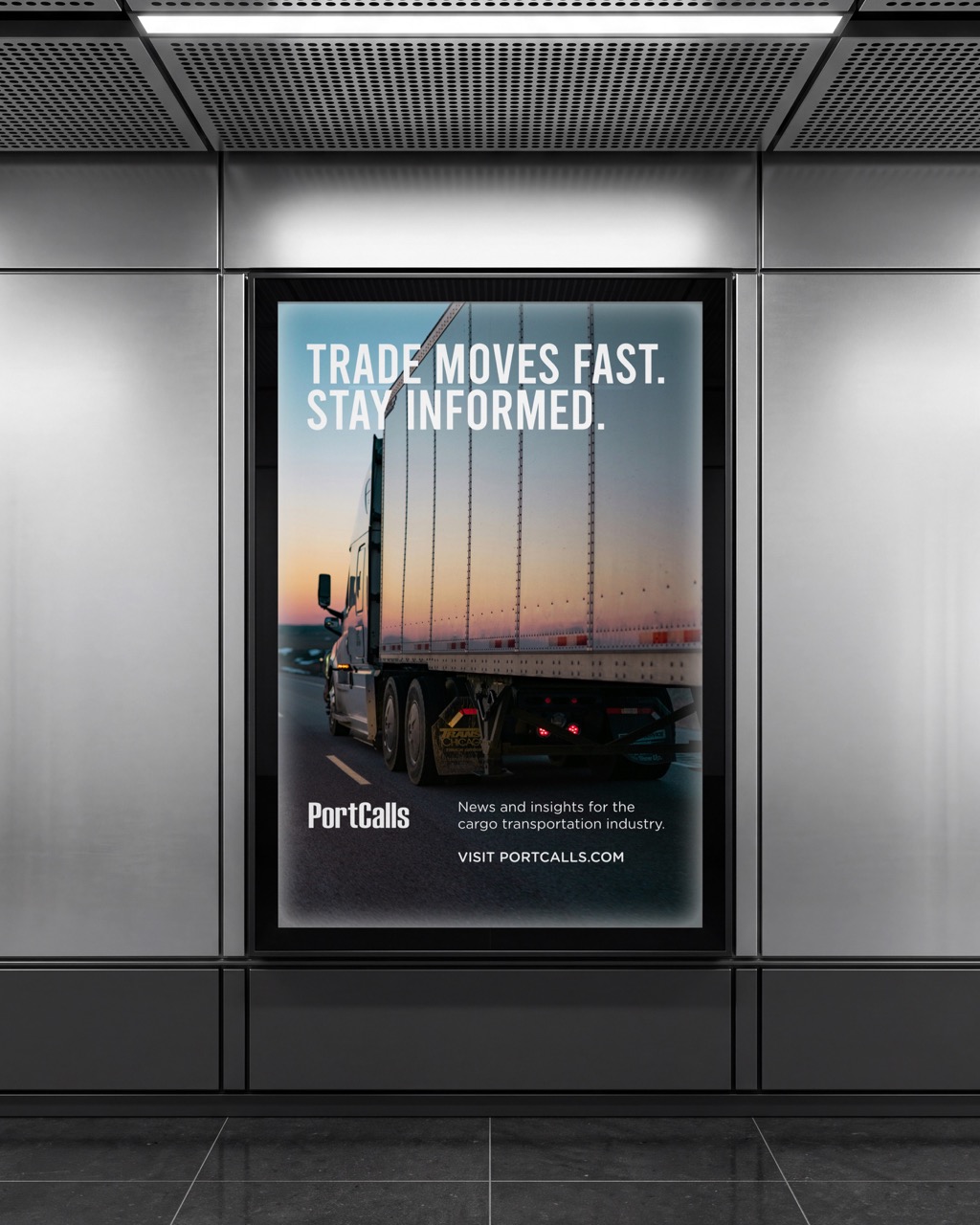
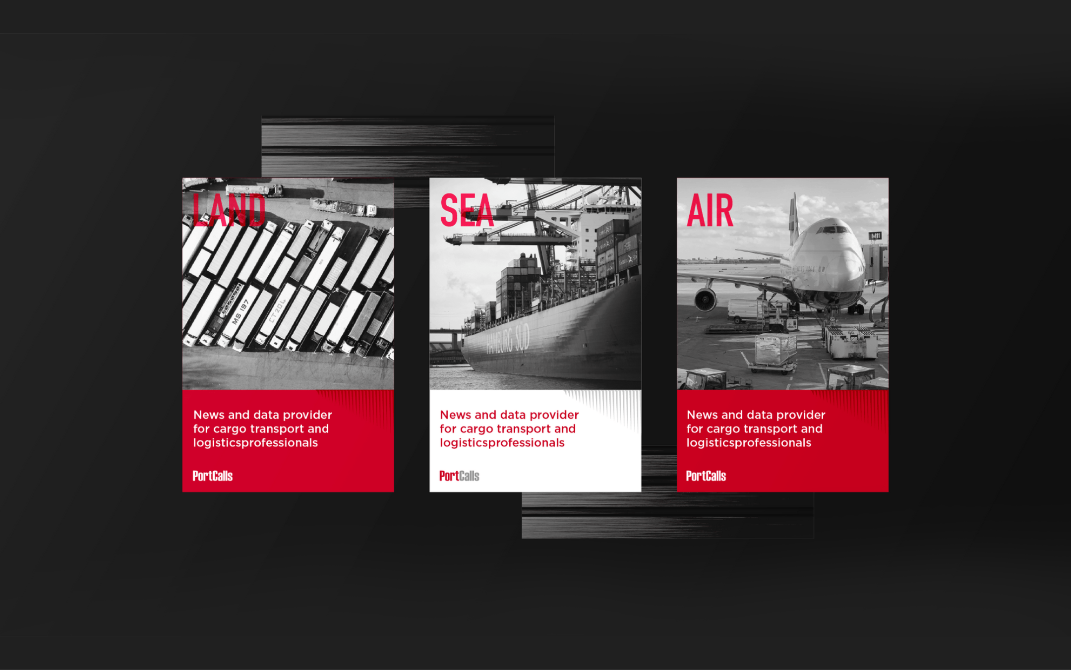
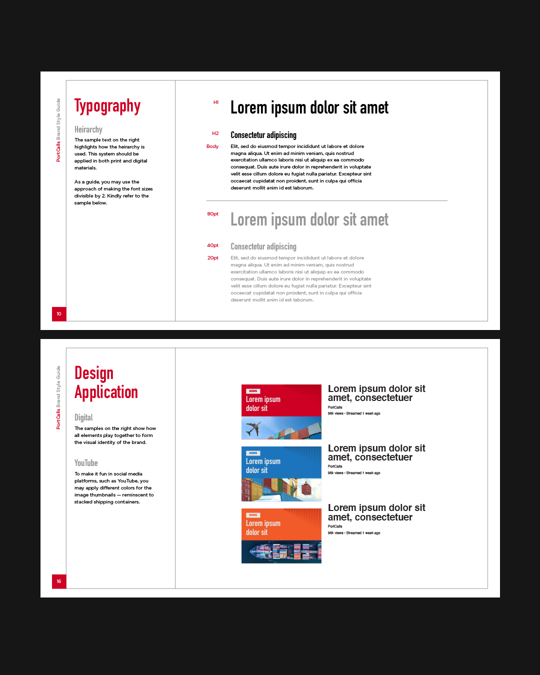
The broader identity system is intentionally simple and functional, built around legible typography, a bold color palette, and a distinctive graphic inspired by the hard lines of cargo containers. Together, these elements create a clear, recognizable visual language designed to work across platforms and applications.
See Next Project